matplotlib使用Latex渲染

3493 字
17 分钟
matplotlib使用Latex渲染

为什么要使用Latex渲染#

在使用 Matplotlib 绘制论文插图或技术图表时,默认的数学公式渲染虽然已经足够日常使用,但在字体一致性、公式排版质量和出版规范方面,往往很难完全满足正式写作的需求。尤其是当图中包含希腊字母、上下标、分式、矩阵、特殊符号或复杂物理量表达式时,Matplotlib 自带的 mathtext 与论文正文中的 LaTeX 公式可能会在字体、粗细、间距和符号形态上出现明显差异。启用 LaTeX 渲染后,图中的文字和公式可以交由真正的 LaTeX 系统处理,从而获得与论文正文高度一致的排版效果,使图像看起来更加专业、统一,也更适合直接用于学位论文、期刊论文和学术报告。

要求坐标轴标签中同时出现常规、粗体、斜体、希腊字母、上下标以及不同字体样式时,Matplotlib 默认的文本渲染就会显得不够灵活。比如希望在同一个标签中写出类似“Yield Strength\mathbf{Yield\ Strength}, σy\sigma_\mathrm{y} / MPa”这样的表达,其中英文变量需要斜体,物理量符号需要符合数学排版习惯,说明性文字又希望保持正体甚至加粗。如果只依赖普通字符串或 Matplotlib 自带的 mathtext,虽然也能实现一部分效果,但在复杂排版、字体一致性和细节控制上容易遇到限制。此时使用 LaTeX 渲染就很有优势:我们可以直接使用 LaTeX 语法控制字体、上下标、数学符号和文本样式,让图中的标签与论文正文中的公式风格保持一致。

接下来,我将以一个 Matplotlib 自带渲染引擎几乎无法优雅排版的图像为例,展示为什么在一些学术绘图场景中,我们需要引入 LaTeX 渲染。

这个例子中,坐标轴标签不仅包含普通文本,还同时涉及粗体、斜体、上下标、希腊字母、单位、数学符号以及局部字体样式切换。如果继续使用 Matplotlib 默认的文本系统,往往会出现字体不统一、加粗失效、斜体不自然、上下标间距不协调、公式与正文风格割裂等问题。虽然通过 mathtext 可以勉强完成一部分排版,但代码会变得繁琐,可控性也有限。

而启用 LaTeX 渲染后,这类复杂标签就可以直接按照 LaTeX 的方式书写:哪些内容是正体,哪些变量需要斜体,哪些部分需要加粗,哪些符号属于数学模式,都可以被精确控制。换句话说,LaTeX 渲染并不是为了“炫技”,而是在复杂学术标注中提供一种更加稳定、统一、可复现的排版方案。

可以,把这一节改成下面这样:

前期准备:安装 LaTeX#

在 Matplotlib 中启用 LaTeX 渲染之前,需要先安装完整的 LaTeX 发行版。这里不建议依赖系统自带的包管理器安装零散组件,而是直接安装 TeX Live。TeX Live 是目前最常用的 LaTeX 发行版之一,支持 Windows、Linux 和 macOS;在 macOS 上对应的发行版通常称为 MacTeX。清华大学 TUNA 镜像站也提供了 TeX Live 的镜像安装资源。(清华大学镜像站)

推荐直接从清华源下载 TeX Live ISO 镜像:

https://mirrors.tuna.tsinghua.edu.cn/CTAN/systems/texlive/Images/

以 TeX Live 2026 为例,对应的 ISO 文件通常是:

https://mirrors.tuna.tsinghua.edu.cn/CTAN/systems/texlive/Images/texlive2026.iso

下载完成后,挂载或解压 ISO,然后运行安装程序:

Terminal window
# Linux / macOS
perl install-tl

Windows 用户则可以在解压后的目录中运行:

install-tl-windows.bat

安装完成后,需要确认 LaTeX 命令已经加入环境变量。可以在终端中检查:

Terminal window
latex --version
pdflatex --version
dvipng --version

如果这些命令能够正常输出版本信息,说明 Matplotlib 已经可以调用系统中的 LaTeX 工具链。之后即可在 Python 中启用 LaTeX 渲染:

import matplotlib.pyplot as plt
plt.rcParams.update({
"text.usetex": True,
"font.family": "serif",
})

另外,建议把 TeX Live 的宏包源也设置为清华源,后续更新宏包会更快:

Terminal window
tlmgr option repository https://mirrors.tuna.tsinghua.edu.cn/CTAN/systems/texlive/tlnet/
tlmgr update --self --all

这样安装的是完整 TeX Live,而不是系统包管理器中的拆分版 LaTeX 环境。对于 Matplotlib 的 LaTeX 渲染来说,这种方式更稳定,也更容易避免缺少宏包、字体或辅助工具导致的报错。

使用Latex 渲染字体#

我们只需要使用如下代码,就可以在matplotlib中使用Latex渲染字体:

import matplotlib.pyplot as plt
plt.rcParams.update({
"text.usetex": True,
"font.family": "serif",
"text.latex.preamble": r"""
\usepackage{newtxtext}
\usepackage{newtxmath}
""",
})

需要注意的是,这里使用的是 newtxtextnewtxmath 提供的 Times-like 字体方案,而不是直接调用系统中的 Microsoft Times New Roman 字体。newtxtext 负责正文文本字体,newtxmath 负责数学公式字体,两者风格统一,因此非常适合用于包含变量、希腊字母、上下标和单位的科研图表。

相比于只设置:

"font.serif": ["Times New Roman"]

这种方式更加稳定。因为在 text.usetex=True 模式下,Matplotlib 会把文本交给 LaTeX 工具链处理,普通的 Matplotlib 字体设置并不一定能真正作用到 LaTeX 渲染结果。而通过 LaTeX 宏包指定字体,可以确保图中的正文、符号和公式采用一致的 Times 风格。

严格来说,newtx 并不等同于 Times New Roman,但它属于 LaTeX 生态中常用的 Times 风格字体方案,视觉上接近 Times,并且数学字体配套完整。对于论文插图而言,它通常比“强行使用系统 Times New Roman + 默认数学字体”更加协调,也更容易满足期刊对图片字体风格的要求。

如果要求使用Arial字体,可以使用如下代码:

import matplotlib.pyplot as plt
plt.rcParams.update({
"text.usetex": True,
"font.family": "sans-serif",
"font.sans-serif": ["Helvetica"],
"text.latex.preamble": r"""
\usepackage{helvet}
\usepackage{sansmath}
\sansmath
""",
})

需要注意的是,在 Matplotlib 的 text.usetex=True 模式下,默认调用的是传统 LaTeX 工具链,因此这里使用的并不一定是系统中的 Microsoft Arial 字体,而是 LaTeX 中的 Helvetica-like 字体。它在视觉效果上与 Arial 比较接近,属于常见的无衬线字体方案,也更容易在 LaTeX 环境中稳定工作。

如果希望坐标轴标签、刻度文字和公式都尽量保持无衬线风格,关键在于这几行:

\usepackage{helvet}
\usepackage{sansmath}
\sansmath

其中,helvet 用于将正文切换到 Helvetica 风格字体,sansmath 则用于让数学公式也尽量使用无衬线字体。否则可能会出现普通文字是无衬线字体,但公式仍然是默认衬线数学字体的情况,导致图中的字体风格不统一。

Latex渲染字体的完整范例#

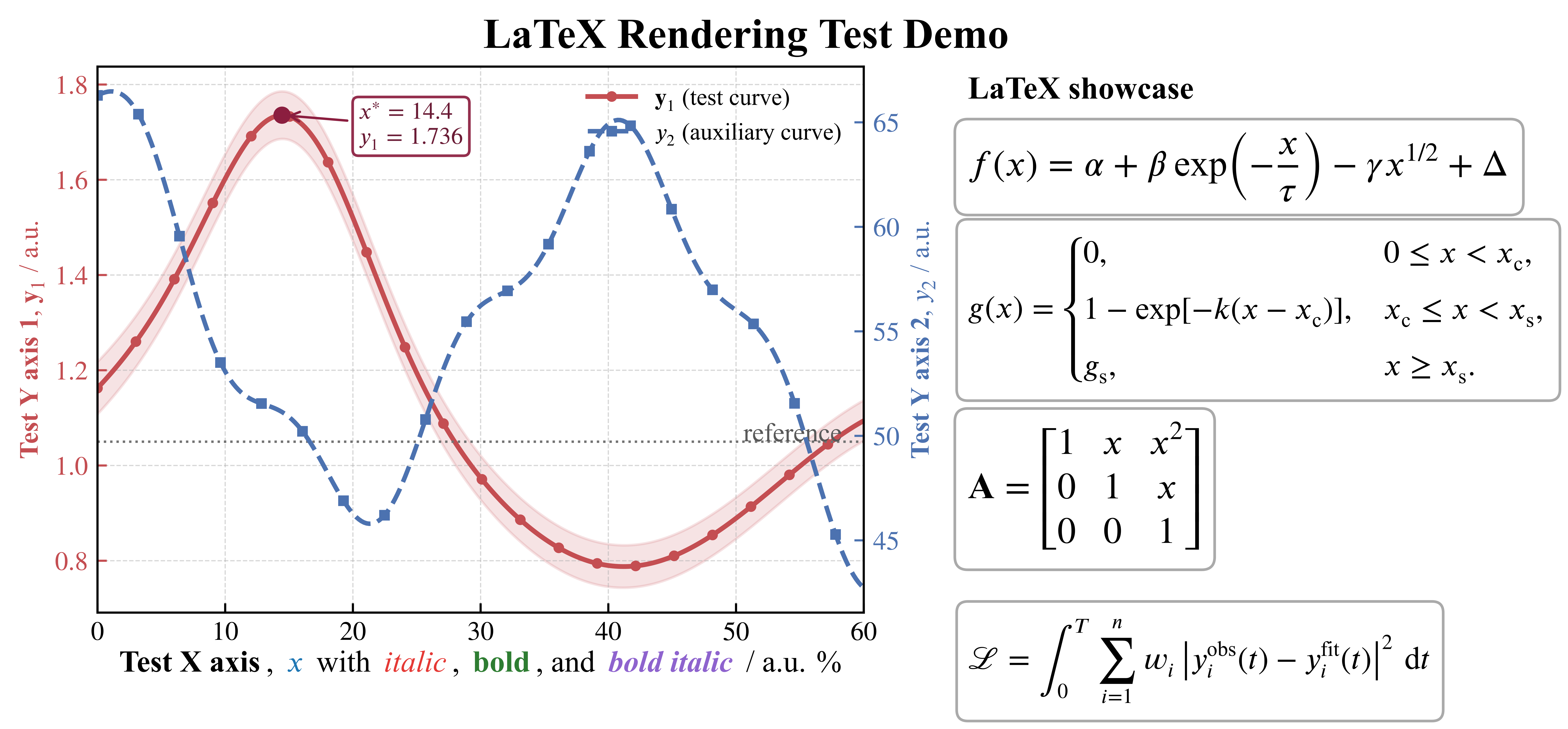
以下是一个完整的范例,使用pltsci库和Latex渲染,常规渲染无法画出这种图片

import numpy as np
import matplotlib.pyplot as plt
from matplotlib.offsetbox import AnchoredOffsetbox, HPacker, TextArea
from pltsci import whole_plot_set, cm
whole_plot_set()
plt.rcParams.update({
"text.usetex": True,
"font.family": "serif",
"text.latex.preamble": r"""
\usepackage{newtxtext}
\usepackage{newtxmath}
\usepackage{bm}
\usepackage{amsmath}
""",
"axes.unicode_minus": False,
})
# =========================
# Data
# =========================
x = np.linspace(0, 60, 300)
y1 = 1.15 + 0.22*np.sin(x/8.5) + 0.42*np.exp(-((x-15)/8.0)**2) - 0.0035*x
y1_err = 0.04 + 0.015*np.exp(-x/35)
y2 = 58 + 9*np.cos(x/7.0 + 0.4) - 0.09*x + 1.8*np.sin(x/2.0)
peak_idx = np.argmax(y1)
x_peak = x[peak_idx]
y_peak = y1[peak_idx]
# =========================
# Figure layout
# =========================
fig = plt.figure(figsize=(cm(20), cm(10.5)), dpi=300)
gs = fig.add_gridspec(1, 2, width_ratios=[1.45, 1.0], wspace=0.12)
ax = fig.add_subplot(gs[0, 0])
ax_info = fig.add_subplot(gs[0, 1])
ax_info.axis("off")
# =========================
# Left axis
# =========================
ln1 = ax.plot(
x, y1,
color="#C44E52",
linewidth=1.8,
marker="o",
markersize=3.0,
markevery=15,
label=r"$\bm{y}_{1}$ (test curve)"
)
ax.fill_between(
x, y1 - y1_err, y1 + y1_err,
color="#C44E52", alpha=0.16
)
ax.scatter([x_peak], [y_peak], color="#8B1E3F", s=30, zorder=5)
ax.annotate(
rf"$x^\ast = {x_peak:.1f}$" "\n" rf"$y_1 = {y_peak:.3f}$",
xy=(x_peak, y_peak),
xytext=(x_peak + 6, y_peak - 0.06),
arrowprops=dict(arrowstyle="->", lw=0.9, color="#8B1E3F"),
fontsize=9,
color="#6A1B35",
bbox=dict(boxstyle="round,pad=0.25", facecolor="white", edgecolor="#8B1E3F", alpha=0.92)
)
ax.set_ylabel(
r"\textbf{Test Y axis 1}, $\bm{y}_{1}$ / a.u.",
color="#C44E52"
)
ax.tick_params(axis="y", colors="#C44E52")
# =========================
# Right axis
# =========================
ax2 = ax.twinx()
ln2 = ax2.plot(
x, y2,
color="#4C72B0",
linewidth=1.7,
linestyle="--",
marker="s",
markersize=3.0,
markevery=16,
label=r"$y_{2}$ (auxiliary curve)"
)
ax2.set_ylabel(
r"\textbf{Test Y axis 2}, $y_{2}$ / a.u.",
color="#4C72B0"
)
ax2.tick_params(axis="y", colors="#4C72B0")
# =========================
# Main axis style
# =========================
ax.set_xlim(0, 60)
ax.set_xticks(np.arange(0, 61, 10))
ax.grid(which="major", linestyle="--", linewidth=0.45, alpha=0.5)
ax.axhline(1.05, color="0.45", lw=0.9, ls=":")
ax.text(
0.98, 1.05, " reference ",
transform=ax.get_yaxis_transform(),
ha="right", va="bottom",
color="0.35"
)
# =========================
# Rich x-label
# =========================
ax.set_xlabel("")
xlabel_parts = [
TextArea(r"\textbf{Test X axis}", textprops=dict(color="black", size=11.5)),
TextArea(r", ", textprops=dict(color="black", size=11.5)),
TextArea(r"$x$", textprops=dict(color="#1f77b4", size=11.5)),
TextArea(r" with ", textprops=dict(color="black", size=11.5)),
TextArea(r"\textit{italic}", textprops=dict(color="#E53935", size=11.5)),
TextArea(r", ", textprops=dict(color="black", size=11.5)),
TextArea(r"\textbf{bold}", textprops=dict(color="#2E7D32", size=11.5)),
TextArea(r", and ", textprops=dict(color="black", size=11.5)),
TextArea(r"\textbf{\textit{bold italic}}", textprops=dict(color="#8E63CE", size=11.5)),
TextArea(r" / a.u. \%", textprops=dict(color="black", size=11.5)),
]
xlabel_box = HPacker(children=xlabel_parts, align="center", pad=0, sep=1)
anchored_xlabel = AnchoredOffsetbox(
loc="lower center",
child=xlabel_box,
pad=0.0,
frameon=False,
bbox_to_anchor=(0.5, -0.12),
bbox_transform=ax.transAxes,
borderpad=0.0
)
ax.add_artist(anchored_xlabel)
# =========================
# Legend
# =========================
lines = ln1 + ln2
labels = [line.get_label() for line in lines]
ax.legend(
lines, labels,
loc="upper right",
frameon=False,
fontsize=9
)
# =========================
# Title
# =========================
fig.suptitle(
r"\textbf{LaTeX Rendering Test Demo}",
y=0.97,
fontsize=16
)
# =========================
# Formula panel
# =========================
ax_info.text(
0.05, 0.98,
r"\textbf{LaTeX showcase}",
va="top", ha="left", fontsize=12
)
# Formula 1
ax_info.text(
0.05, 0.88,
r"$f(x)=\alpha+\beta \exp\!\left(-\frac{x}{\tau}\right)-\gamma x^{1/2}+\Delta$",
va="top", ha="left", fontsize=14,
bbox=dict(boxstyle="round,pad=0.35", facecolor="white", edgecolor="0.65", alpha=0.95)
)
# Formula 2: piecewise
ax_info.text(
0.05, 0.7,
r"$g(x)=\begin{cases}"
r"0, & 0\leq x < x_{\mathrm{c}},\\[4pt]"
r"1-\exp[-k(x-x_{\mathrm{c}})], & x_{\mathrm{c}}\leq x < x_{\mathrm{s}},\\[4pt]"
r"g_{\mathrm{s}}, & x\geq x_{\mathrm{s}}."
r"\end{cases}$",
va="top", ha="left", fontsize=12,
bbox=dict(boxstyle="round,pad=0.35", facecolor="white", edgecolor="0.65", alpha=0.95)
)
# Formula 3: matrix
ax_info.text(
0.05, 0.35,
r"$\mathbf{A}=\begin{bmatrix}"
r"1 & x & x^2\\"
r"0 & 1 & x\\"
r"0 & 0 & 1"
r"\end{bmatrix}$",
va="top", ha="left", fontsize=14,
bbox=dict(boxstyle="round,pad=0.35", facecolor="white", edgecolor="0.65", alpha=0.95)
)
# Formula 4: large operator
ax_info.text(
0.05, 0.00,
r"$\mathcal{L}=\int_{0}^{T}\sum_{i=1}^{n}"
r"w_i\left|y_i^{\mathrm{obs}}(t)-y_i^{\mathrm{fit}}(t)\right|^2\,\mathrm{d}t$",
va="top", ha="left", fontsize=12,
bbox=dict(boxstyle="round,pad=0.35", facecolor="white", edgecolor="0.65", alpha=0.95)
)
plt.show()

绘图结果如下所示

Latex渲染字体的图片
Latex渲染字体的图片

PGF强化渲染#

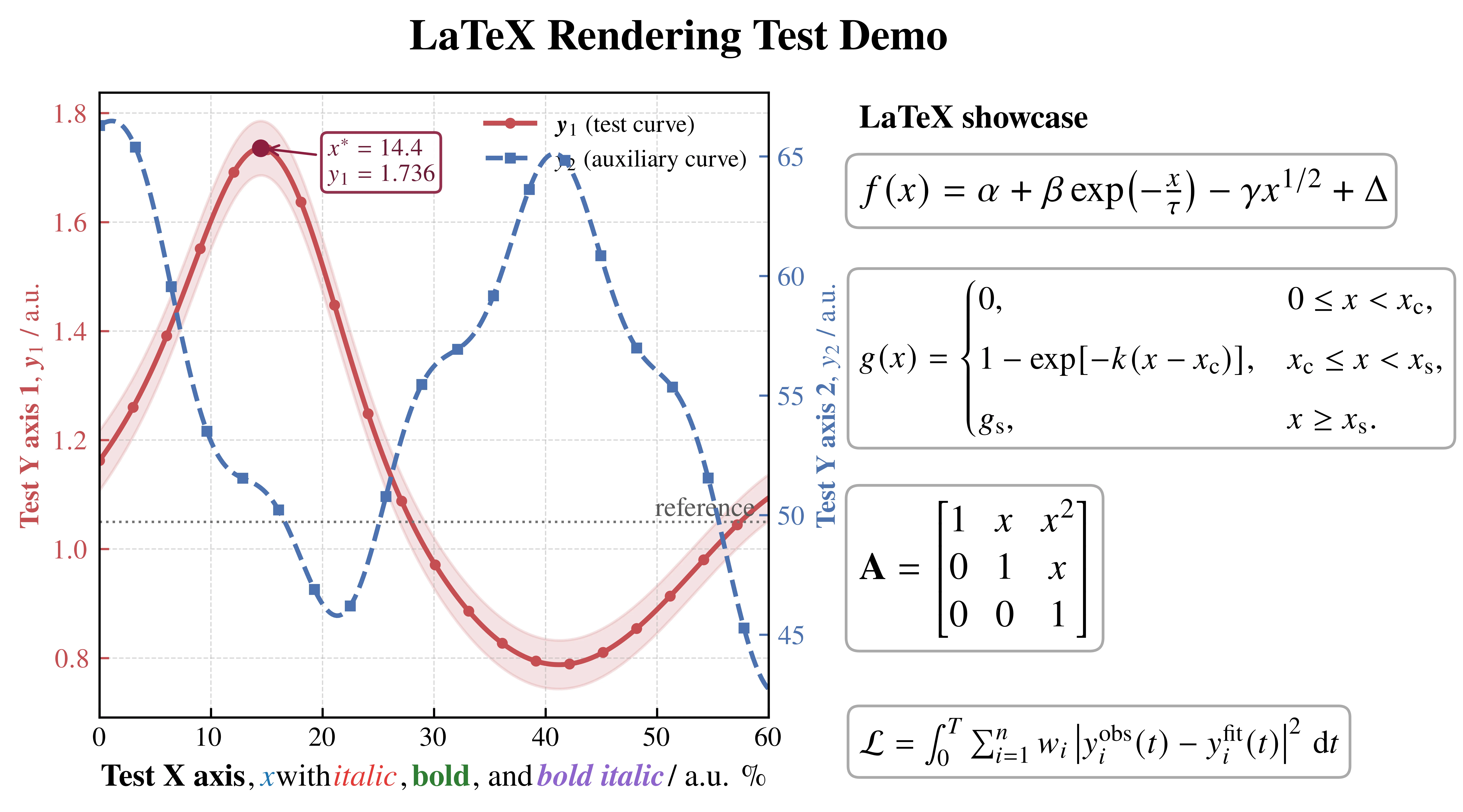
可以看到,上面的 LaTeX 渲染文字的图片可以做到常规渲染达不到的效果,但是仍然有瑕疵,例如 % 这个单位显然不是 Times New Roman 的风格。

这背后的原因是:Matplotlib 中常用的

plt.rcParams["text.usetex"] = True

默认调用的是传统 LaTeX 工具链。即使我们通过

\usepackage{newtxtext}
\usepackage{newtxmath}

获得了接近 Times New Roman 的字体效果,它本质上仍然是 Times-like 字体方案,而不是直接调用系统中的 Microsoft Times New Roman。因此,在整体观感上它已经非常接近论文常用的 Times 风格,但某些细节符号,例如 %、数字、括号、标点和减号,仍然可能与真正的 Times New Roman 存在差异。

如果我们希望进一步提升字体一致性,尤其是让普通文本、单位符号和特殊字符都严格使用系统字体,就可以使用 Matplotlib 的 PGF 后端。PGF 后端的核心思路是:不再让 Matplotlib 直接完成最终文字排版,而是将图中的文字交给 XeLaTeX 或 LuaLaTeX 处理。这样我们就可以使用 fontspecunicode-math 直接指定系统字体,例如:

\setmainfont{Times New Roman}
\setmathfont{XITS Math}

其中,Times New Roman 用于普通文本和单位符号,XITS Math 用于数学公式。XITS Math 本身也是 Times 风格的数学字体,因此它和 Times New Roman 搭配起来比较协调。这样一来,图中的正文、百分号、单位、数字以及数学符号都会更加统一。

在 Matplotlib 中,可以这样启用 PGF 后端:

import matplotlib as mpl
# 必须在导入 pyplot 之前设置
mpl.use("pgf")
import matplotlib.pyplot as plt
mpl.rcParams.update({
"pgf.texsystem": "xelatex",
"pgf.rcfonts": False,
"font.family": "serif",
"font.serif": ["Times New Roman"],
"axes.unicode_minus": False,
"pgf.preamble": r"""
\usepackage{fontspec}
\usepackage{unicode-math}
\setmainfont{Times New Roman}
\setmathfont{XITS Math}
""",
})

需要注意的是,PGF 渲染时不再主要依赖:

"text.usetex": True

而是通过:

"pgf.texsystem": "xelatex"

指定由 XeLaTeX 完成排版。因此,PGF 方案更适合需要严格字体控制的最终出图,例如论文插图、出版图和对字体细节要求较高的技术报告。

不过,PGF 后端也不是完全没有代价。它的渲染速度通常比普通 Matplotlib 更慢,对本机 LaTeX 环境的依赖也更强;如果系统中没有安装 xelatexTimes New RomanXITS Math,就可能出现编译失败。因此,我个人更推荐将它作为“最终出图方案”:日常调试时可以先使用普通 Matplotlib 或 usetex=True,等图形内容、尺寸和布局都确定之后,再切换到 PGF 后端导出高质量 PDF。

PGF渲染完整范例#

import numpy as np
import matplotlib as mpl
# 必须在 pyplot 前
mpl.use("pgf")
import matplotlib.pyplot as plt
from matplotlib.offsetbox import AnchoredOffsetbox, HPacker, TextArea
from pltsci import whole_plot_set, cm
whole_plot_set()
mpl.rcParams.update({
"pgf.texsystem": "xelatex",
"pgf.rcfonts": False,
"font.family": "serif",
"font.serif": ["Times New Roman"],
"axes.unicode_minus": False,
"pgf.preamble": r"""
\usepackage{fontspec}
\usepackage{unicode-math}
\usepackage{amsmath}
\usepackage{xcolor}
\setmainfont{Times New Roman}
\setmathfont{XITS Math}
""",
})
# =========================
# Data
# =========================
x = np.linspace(0, 60, 300)
y1 = 1.15 + 0.22*np.sin(x/8.5) + 0.42*np.exp(-((x-15)/8.0)**2) - 0.0035*x
y1_err = 0.04 + 0.015*np.exp(-x/35)
y2 = 58 + 9*np.cos(x/7.0 + 0.4) - 0.09*x + 1.8*np.sin(x/2.0)
peak_idx = np.argmax(y1)
x_peak = x[peak_idx]
y_peak = y1[peak_idx]
# =========================
# Figure layout
# =========================
fig = plt.figure(figsize=(cm(20), cm(10.5)), dpi=300)
gs = fig.add_gridspec(1, 2, width_ratios=[1.45, 1.0], wspace=0.12)
ax = fig.add_subplot(gs[0, 0])
ax_info = fig.add_subplot(gs[0, 1])
ax_info.axis("off")
# =========================
# Left axis
# =========================
ln1 = ax.plot(
x, y1,
color="#C44E52",
linewidth=1.8,
marker="o",
markersize=3.0,
markevery=15,
label=r"$\symbf{y}_{1}$ (test curve)"
)
ax.fill_between(
x, y1 - y1_err, y1 + y1_err,
color="#C44E52", alpha=0.16
)
ax.scatter([x_peak], [y_peak], color="#8B1E3F", s=30, zorder=5)
ax.annotate(
rf"$x^\ast = {x_peak:.1f}$" "\n" rf"$y_1 = {y_peak:.3f}$",
xy=(x_peak, y_peak),
xytext=(x_peak + 6, y_peak - 0.06),
arrowprops=dict(arrowstyle="->", lw=0.9, color="#8B1E3F"),
fontsize=9,
color="#6A1B35",
bbox=dict(boxstyle="round,pad=0.25", facecolor="white", edgecolor="#8B1E3F", alpha=0.92)
)
ax.set_ylabel(
r"\textbf{Test Y axis 1}, $\symbf{y}_{1}$ / a.u.",
color="#C44E52"
)
ax.tick_params(axis="y", colors="#C44E52")
# =========================
# Right axis
# =========================
ax2 = ax.twinx()
ln2 = ax2.plot(
x, y2,
color="#4C72B0",
linewidth=1.7,
linestyle="--",
marker="s",
markersize=3.0,
markevery=16,
label=r"$y_{2}$ (auxiliary curve)"
)
ax2.set_ylabel(
r"\textbf{Test Y axis 2}, $y_{2}$ / a.u.",
color="#4C72B0"
)
ax2.tick_params(axis="y", colors="#4C72B0")
# =========================
# Main axis style
# =========================
ax.set_xlim(0, 60)
ax.set_xticks(np.arange(0, 61, 10))
ax.grid(which="major", linestyle="--", linewidth=0.45, alpha=0.5)
ax.axhline(1.05, color="0.45", lw=0.9, ls=":")
ax.text(
0.98, 1.05, " reference ",
transform=ax.get_yaxis_transform(),
ha="right", va="bottom",
color="0.35"
)
# =========================
# Rich x-label
# =========================
ax.set_xlabel("")
xlabel_parts = [
TextArea(r"\textbf{Test X axis}", textprops=dict(color="black", size=11.5)),
TextArea(r", ", textprops=dict(color="black", size=11.5)),
TextArea(r"$x$", textprops=dict(color="#1f77b4", size=11.5)),
TextArea(r" with ", textprops=dict(color="black", size=11.5)),
TextArea(r"\textit{italic}", textprops=dict(color="#E53935", size=11.5)),
TextArea(r", ", textprops=dict(color="black", size=11.5)),
TextArea(r"\textbf{bold}", textprops=dict(color="#2E7D32", size=11.5)),
TextArea(r", and ", textprops=dict(color="black", size=11.5)),
TextArea(r"\textbf{\textit{bold italic}}", textprops=dict(color="#8E63CE", size=11.5)),
TextArea(r" / a.u. \%", textprops=dict(color="black", size=11.5)),
]
xlabel_box = HPacker(children=xlabel_parts, align="center", pad=0, sep=2)
anchored_xlabel = AnchoredOffsetbox(
loc="lower center",
child=xlabel_box,
pad=0.0,
frameon=False,
bbox_to_anchor=(0.5, -0.12),
bbox_transform=ax.transAxes,
borderpad=0.0
)
ax.add_artist(anchored_xlabel)
# =========================
# Legend
# =========================
lines = ln1 + ln2
labels = [line.get_label() for line in lines]
ax.legend(
lines, labels,
loc="upper right",
frameon=False,
fontsize=9
)
# =========================
# Title
# =========================
fig.suptitle(
r"\textbf{LaTeX Rendering Test Demo}",
y=0.97,
fontsize=16
)
# =========================
# Formula panel
# =========================
ax_info.text(
0.05, 0.98,
r"\textbf{LaTeX showcase}",
va="top", ha="left", fontsize=12
)
# Formula 1
ax_info.text(
0.05, 0.88,
r"$f(x)=\alpha+\beta \exp\!\left(-\frac{x}{\tau}\right)-\gamma x^{1/2}+\Delta$",
va="top", ha="left", fontsize=14,
bbox=dict(boxstyle="round,pad=0.35", facecolor="white", edgecolor="0.65", alpha=0.95)
)
# Formula 2: piecewise
ax_info.text(
0.05, 0.7,
r"$g(x)=\begin{cases}"
r"0, & 0\leq x < x_{\mathrm{c}},\\[4pt]"
r"1-\exp[-k(x-x_{\mathrm{c}})], & x_{\mathrm{c}}\leq x < x_{\mathrm{s}},\\[4pt]"
r"g_{\mathrm{s}}, & x\geq x_{\mathrm{s}}."
r"\end{cases}$",
va="top", ha="left", fontsize=12,
bbox=dict(boxstyle="round,pad=0.35", facecolor="white", edgecolor="0.65", alpha=0.95)
)
# Formula 3: matrix
ax_info.text(
0.05, 0.35,
r"$\mathbf{A}=\begin{bmatrix}"
r"1 & x & x^2\\"
r"0 & 1 & x\\"
r"0 & 0 & 1"
r"\end{bmatrix}$",
va="top", ha="left", fontsize=14,
bbox=dict(boxstyle="round,pad=0.35", facecolor="white", edgecolor="0.65", alpha=0.95)
)
# Formula 4: large operator
ax_info.text(
0.05, 0.0,
r"$\mathcal{L}=\int_{0}^{T}\sum_{i=1}^{n}"
r"w_i\left|y_i^{\mathrm{obs}}(t)-y_i^{\mathrm{fit}}(t)\right|^2\,\mathrm{d}t$",
va="top", ha="left", fontsize=12,
bbox=dict(boxstyle="round,pad=0.35", facecolor="white", edgecolor="0.65", alpha=0.95)
)
fig.subplots_adjust(left=0.07, right=0.98, top=0.91, bottom=0.22)
# 推荐保存
plt.savefig("latex_rendering_test_demo.pdf", bbox_inches="tight")
plt.savefig("latex_rendering_test_demo.pgf", bbox_inches="tight")
plt.savefig("latex_rendering_test_demo.png", dpi=1200, bbox_inches="tight")

注意的是,pfg渲染通常无法在jupyter中预览图片,因此需要打开图片文件查看。渲染结果如下所示。可以看到,其中的%是Times new roman风格,且字体排版也更加美观合理。

pgf渲染的图片
pgf渲染的图片

matplotlib使用Latex渲染
http://localhost:4321/public/posts/matplotlib使用Latex渲染/
作者
开萌
发布于
2026-05-08
许可协议
CC BY-NC-SA 4.0
Profile Image of the Author
开萌
记录材料计算、科研绘图与开发配置。
分类
标签

目录