 开萌笔记本
开萌笔记本 

使用Pymatgen计算PhaseDiagram
1367 字
7 分钟
使用Pymatgen计算PhaseDiagram

概述
PhaseDiagram是Pymatgen中一个非常重要的类,可以用来计算和绘制相图。通过PhaseDiagram,我们可以分析材料的稳定性、相变行为以及预测新的材料组合。本文将介绍如何使用Pymatgen计算PhaseDiagram,并提供一些常用的导入和基础代码示例。 下面是一些使用PhaseDiagram时常用的导入和基础代码示例。
准备工作
首先导入必要的库:
import re
import matplotlib.pyplot as pltimport numpy as npimport pandas as pdfrom matplotlib.tri import Triangulationfrom pymatgen.analysis.phase_diagram import PDPlotter, PhaseDiagramfrom pymatgen.core.composition import Compositionfrom pymatgen.core.entries import ComputedEntryfrom scipy.spatial import cKDTreefrom pltsci import cm, set_ticks, half_plot_set,whole_plot_set #设定全局图像格式from adjustText import adjust_textwhole_plot_set()数据准备
这里,我们使用pymatgen中的MPRester库来获取材料数据,并构建相图所需的条目列表。以下是一个示例代码,展示了如何获取Al-Cu-Sc系统的条目并构建相图:
数据如下所示:
| material_id | formula_pretty | formation_energy_per_atom | energy | |
|---|---|---|---|---|
| 0 | mp-813 | ScAl2 | -0.530799 | -1.592396 |
| 1 | mp-2121 | ScAl3 | -0.479127 | -1.916509 |
| 2 | mp-331 | ScAl | -0.466178 | -0.932356 |
| 3 | mp-1219356 | ScAlCu | -0.434098 | -1.302293 |
| 4 | mp-16497 | ScAlCu2 | -0.429006 | -1.716025 |
| ... | ... | ... | ... | ... |
| 56 | mp-567308 | Sc | 0.205734 | 0.205734 |
| 57 | mp-1239196 | Al | 0.302126 | 0.302126 |
| 58 | mp-1209129 | Sc4Al | 0.504860 | 2.524301 |
| 59 | mp-1008681 | Sc | 0.719454 | 0.719454 |
| 60 | mp-1056079 | Cu | 1.982934 | 1.982934 |
61 rows × 4 columns
构建相图
有了数据之后,我们就可以使用Pymatgen的PhaseDiagram类来构建相图了。以下是一个示例代码,展示了如何使用PhaseDiagram类来构建相图:
entries = [ ComputedEntry(Composition(row.formula_pretty), row.energy, entry_id=row.material_id) for row in df_system.itertuples(index=False)]
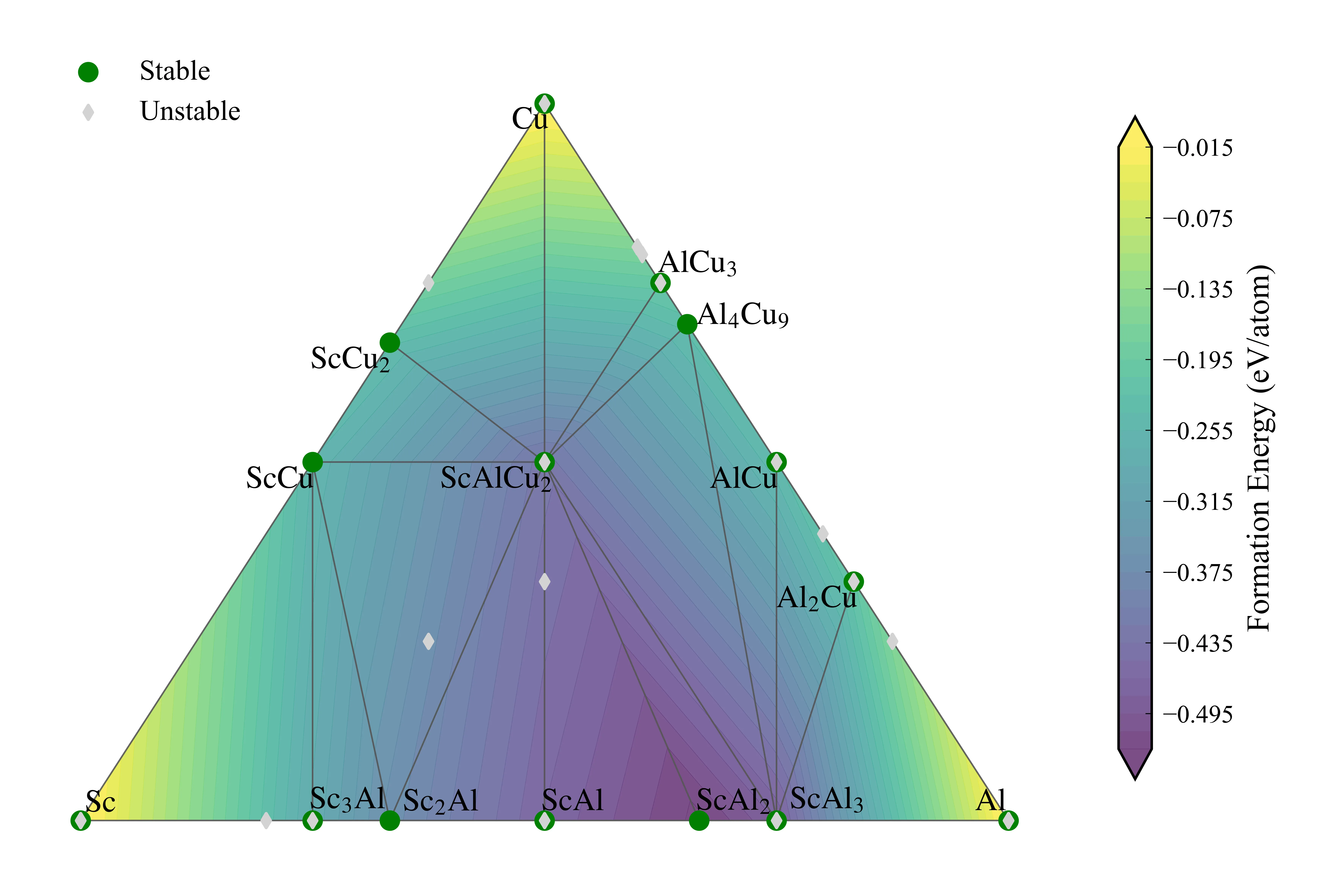
phase_diagram = PhaseDiagram(entries)plotter = PDPlotter(phase_diagram)fig = plotter.get_plot()fig.show()到这里,我们就成功构建了Al-Cu-Sc系统的相图,如下所示。
用于网页展示的话,这个图效果相当好,但是如果需要写入文章,那么这个效果就不太好了。因为这个图是一个交互式的图,写入文章后就失去了交互性了。此外,这种图是为了交互式展示而设计的,写入文章后可能会出现一些显示问题,例如图像模糊、标签重叠等。因此,我们需要提取绘图元数据,使用matplotlib重新绘制一张静态图来写入文章。
提取绘图元数据并使用matplotlib重新绘制相图
Pymatgen的PDPlotter类有一个pd_plot_data属性,我们可以从中提取绘图元数据,例如相图中的点的坐标、颜色、标签等信息,然后使用matplotlib重新绘制一张静态图来写入文章。
以下是一个示例代码,展示了如何提取绘图元数据并使用matplotlib重新绘制相图:
提取绘图元数据
提取的绘图元数据如下:
| material_id | reduced_formula | energy | energy_per_atom | x | y | energy_above_hull | stable | |
|---|---|---|---|---|---|---|---|---|
| 0 | mp-593 | Al4Cu9 | -3.030330 | -0.233102 | 0.653846 | 0.599556 | 0.000000 | True |
| 1 | mp-2121 | ScAl3 | -1.916509 | -0.479127 | 0.750000 | 0.000000 | 0.000000 | True |
| 2 | mp-1169 | ScCu | -0.513136 | -0.256568 | 0.250000 | 0.433013 | 0.000000 | True |
| 3 | mp-1018149 | ScCu2 | -0.709247 | -0.236416 | 0.333333 | 0.577350 | 0.000000 | True |
| 4 | mp-862259 | Sc3Al | -1.155269 | -0.288817 | 0.250000 | 0.000000 | 0.000000 | True |
| ... | ... | ... | ... | ... | ... | ... | ... | ... |
| 50 | mp-567308 | Sc | 0.205734 | 0.205734 | 0.000000 | 0.000000 | 0.205734 | False |
| 30 | mp-1239196 | Al | 0.302126 | 0.302126 | 1.000000 | 0.000000 | 0.302126 | False |
| 51 | mp-1008681 | Sc | 0.719454 | 0.719454 | 0.000000 | 0.000000 | 0.719454 | False |
| 60 | mp-1209129 | Sc4Al | 2.524301 | 0.504860 | 0.200000 | 0.000000 | 0.735914 | False |
| 21 | mp-1056079 | Cu | 1.982934 | 1.982934 | 0.500000 | 0.866025 | 1.982934 | False |
61 rows × 8 columns
定义绘图辅助函数
使用matplotlib重新绘制相图
最终效果如下:
使用Pymatgen计算PhaseDiagram
https://www.kaimoe.cn/posts/使用pymatgen计算phasediagram/ 相关文章 智能推荐
1
Pymatgen计算Gibbs自由能
Pymatgen 记录使用 Pymatgen 处理 Gibbs 自由能与相图分析时的基础代码入口。
2
图片来源记录
站点说明 记录站点中使用到的外部图片原始出处,便于后续核对与补充。
3
使用Phonopy的DFPT方法计算声子谱及热力学性质
VASP计算 使用Phonopy的DFPT方法计算声子谱和热力学性质的详细步骤,包括VASP输入文件的准备、计算流程以及结果的分析。
4
Phonopy画图示例
VASP计算 一个使用Phonopy计算声子谱并进行可视化的示例,包含了从读取Phonopy输出文件到绘制声子谱和态密度的完整流程。
5
yazi终端文件管理器简单教程
Linux 2026-04-05
随机文章 随机推荐